Some iPhone users prefer to see clear edges and borders of buttons, so they stand out more among the usual labels in the user interface. They can turn on the “Button Shapes” toggle in their device’s accessibility settings, so the system can change the appearance of the controls to suit the user’s needs.
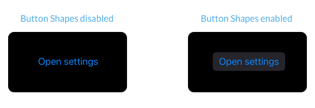
In many cases SwiftUI automatically adjusts the appearance of our controls to match the user’s settings, for example, when we use Button Views with built-in styles or a frame are provided NavigationLink and Link Controls.
A button in SwiftUI with an auto-style will resolve to a button with a border on devices where the “Button Shapes” setting is enabled.
Button("Open settings") {

}
.buttonStyle(.automatic)
But sometimes we need to adjust the appearance of our controls manually to respond to the accessibility setting. This can be necessary when we define custom button styles or embed links inside Text Views. To know if the “Button Shapes” setting is enabled, we can read the accessibilityShowButtonShapes environmental value.
struct ContentView: View {
    @Environment(.accessibilityShowButtonShapes)
    private var accessibilityShowButtonShapes

    var body: some View {
        ...
    }
}
#
Customize custom button styles
When creating custom button styles that do not give a prominent shape to the button, we should consider adding a background, border, or underline to the button when accessibilityShowButtonShapes set to true.
struct ScalingButtonStyle: ButtonStyle {
    @Environment(.accessibilityShowButtonShapes)
    private var accessibilityShowButtonShapes

    func makeBody(configuration: Configuration) -> some View {
        configuration.label
            .foregroundColor(.blue)
            .padding()
            .border(
                .blue,
                width: accessibilityShowButtonShapes ? 1 : 0
            )
            .scaleEffect(configuration.isPressed ? 1.5 : 1)
            .animation(.default, value: configuration.isPressed)
    }
}
#
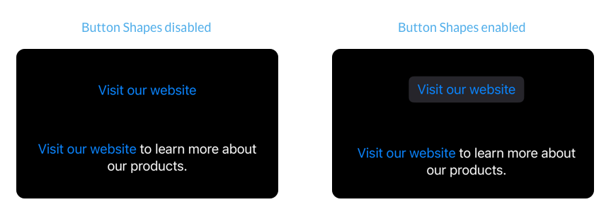
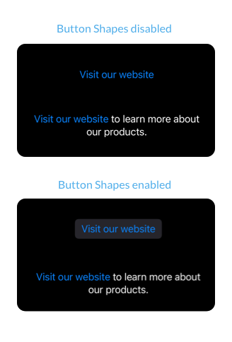
Underline links within text
Independent Link Views and NavigationLinkThey are automatically adjusted to respond to the “Button Shapes” setting. But links are embedded inside Text Views using Markdown or AttributedString Do not change their appearance.
VStack(spacing: 60) {
    Link(
        "Visit our website",
        destination: URL(
            string: "https://example.com"
        )!
    )

    Text("""
    [Visit our website](https://example.com)
    to learn more about our products.
    """)
}
.multilineTextAlignment(.center)
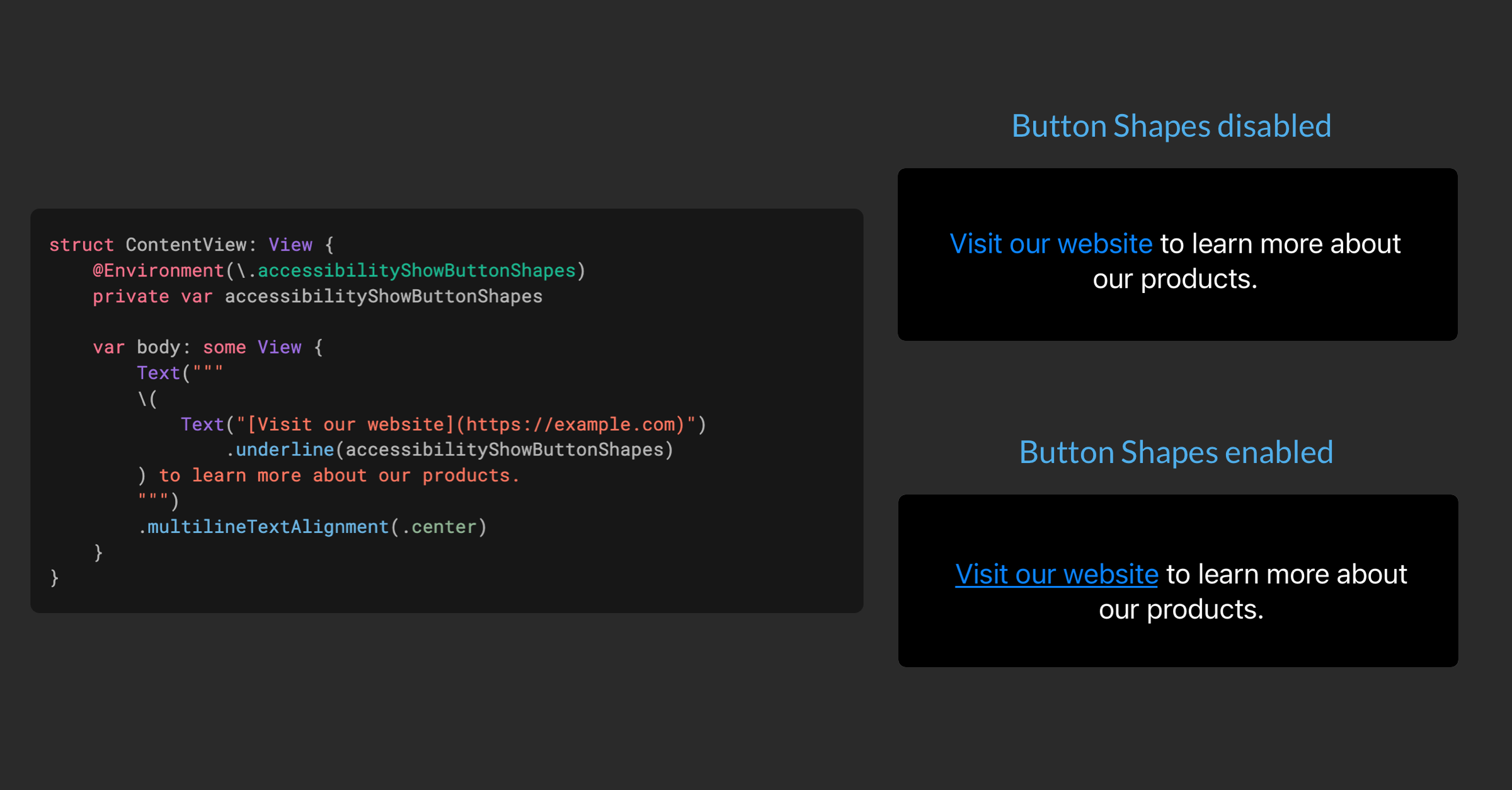
We can make the link within the text more prominent by adding an underscore when accessibilityShowButtonShapes defined as true. We can do this by wrapping it separately Text display and make use of LocalizedStringKey.StringInterpolation.
struct ContentView: View {
    @Environment(.accessibilityShowButtonShapes)
    private var accessibilityShowButtonShapes

    var body: some View {
        Text("""
        (
            Text("[Visit our website](https://example.com)")
                .underline(accessibilityShowButtonShapes)
        ) to learn more about our products.
        """)
        .multilineTextAlignment(.center)
    }
}
If you enjoy our blog and would like to support us, you can Sponsor us on GitHub.
For blog updates and development tips, follow us on Twitter @nilcoalescing.